I spent a long time trying to figure out what to talk about in my fourth blog post.
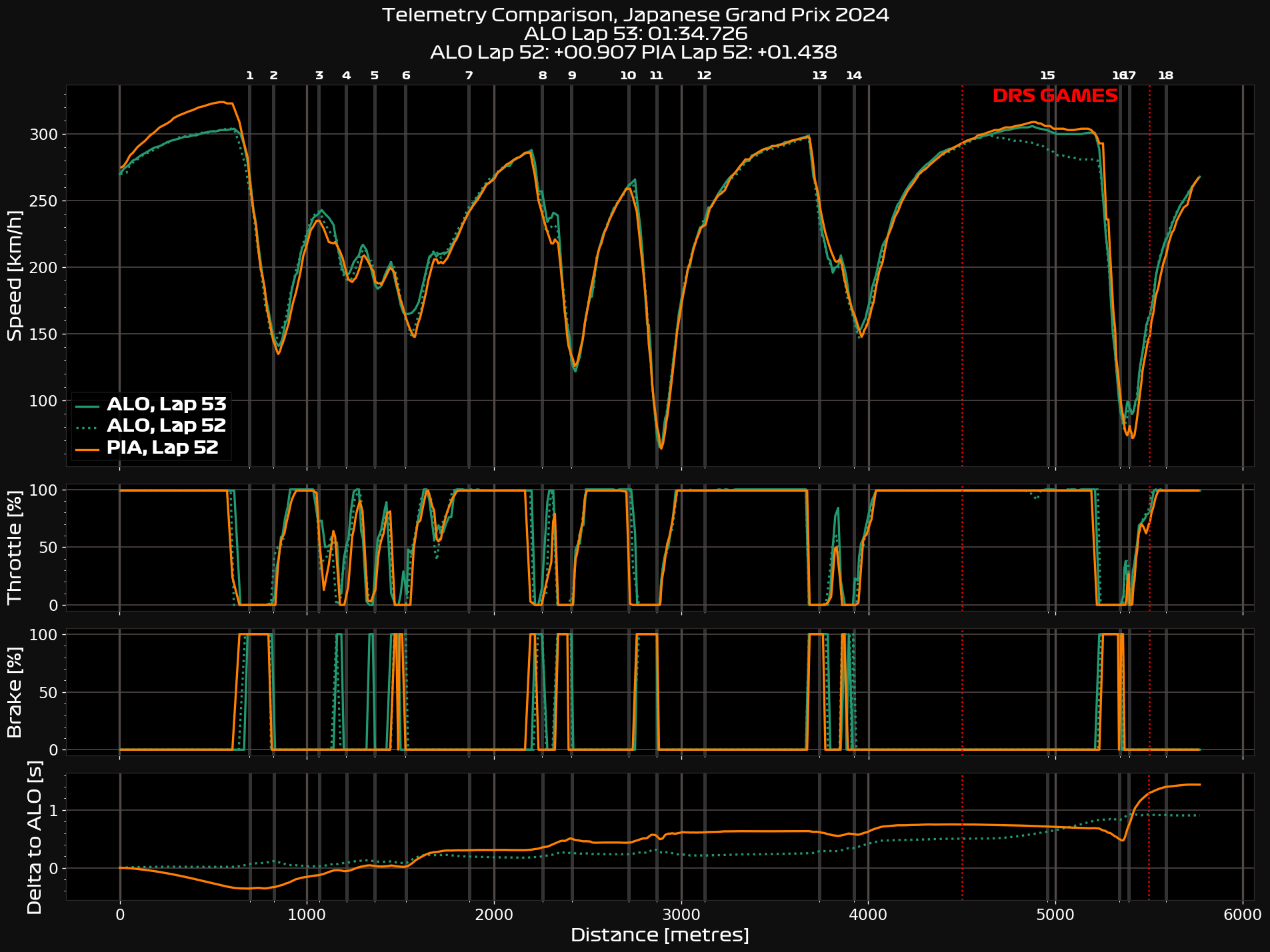
My initial thought was, once again, Fernando Alonso. Right at the end of the Japanese Grand Prix, he proved his cunning by slowing down just enough to keep Oscar Piastri’s McLaren within 1 second and hence within DRS, preventing Russell’s catching Mercedes from overtaking Oscar until the very last lap, keeping Fernando safe in doing so. This secured Alonso in P6, keeping Aston Martin within touching distance of Mercedes in the constructors’ championship, with only one point between the two teams. The problem with this, however, is that I don’t want to talk about Fernando for four races in a row, and I’m really not sure what there is to say other than that it happened; Fernando kept his place, the end. Incidentally, if you want to see the telemetry from Alonso’s slow lap to keep Piastri within DRS compared to the lap afterwards when he was no longer trying to, check here.
It’s interesting — Japan was probably the best racing this season, and yet I find myself largely bereft of ideas. The one thing that piqued my interest was Stroll’s radio message which I’m sure Fernando was proud of,
It’s unbelievable how bad our speed is on the straight, man, like it’s a different category!
Lance Stroll, Lap 48
Top Speeds
This led me down a bit of a rabbit hole.
I created the following graph, to illustrate the speed at which each driver went through the speed trap just after 130R. Each dot represents a different lap, its colour being the stint it was during (everyone changed their tyres in the red flag, so “stints” start at 2). The nebulous shape that develops around that is a great visualisation of how much the speed varies. Sargeant and Hamilton kept almost the same speed through the speed trap throughout the entire race, whereas Hulkenberg or Tsunoda’s varied by almost 20 km/h. It’s also worth noting that unlike a lot of tracks, Suzuka’s speed trap is not on a DRS straight, artificially distorting the apparent top speeds of cars.
What stood out to me is that the Haas cars, which Stroll was racing, have the highest top speed of any car, whereas Stroll is quite slow in comparison. It’s not that Stroll has a slow GP2 engine, but just that the Haas boys were running a low downforce, high top speed setup. This must have frustrated Stroll, who was able to keep up easily in the corners but could make no impact on the straights.

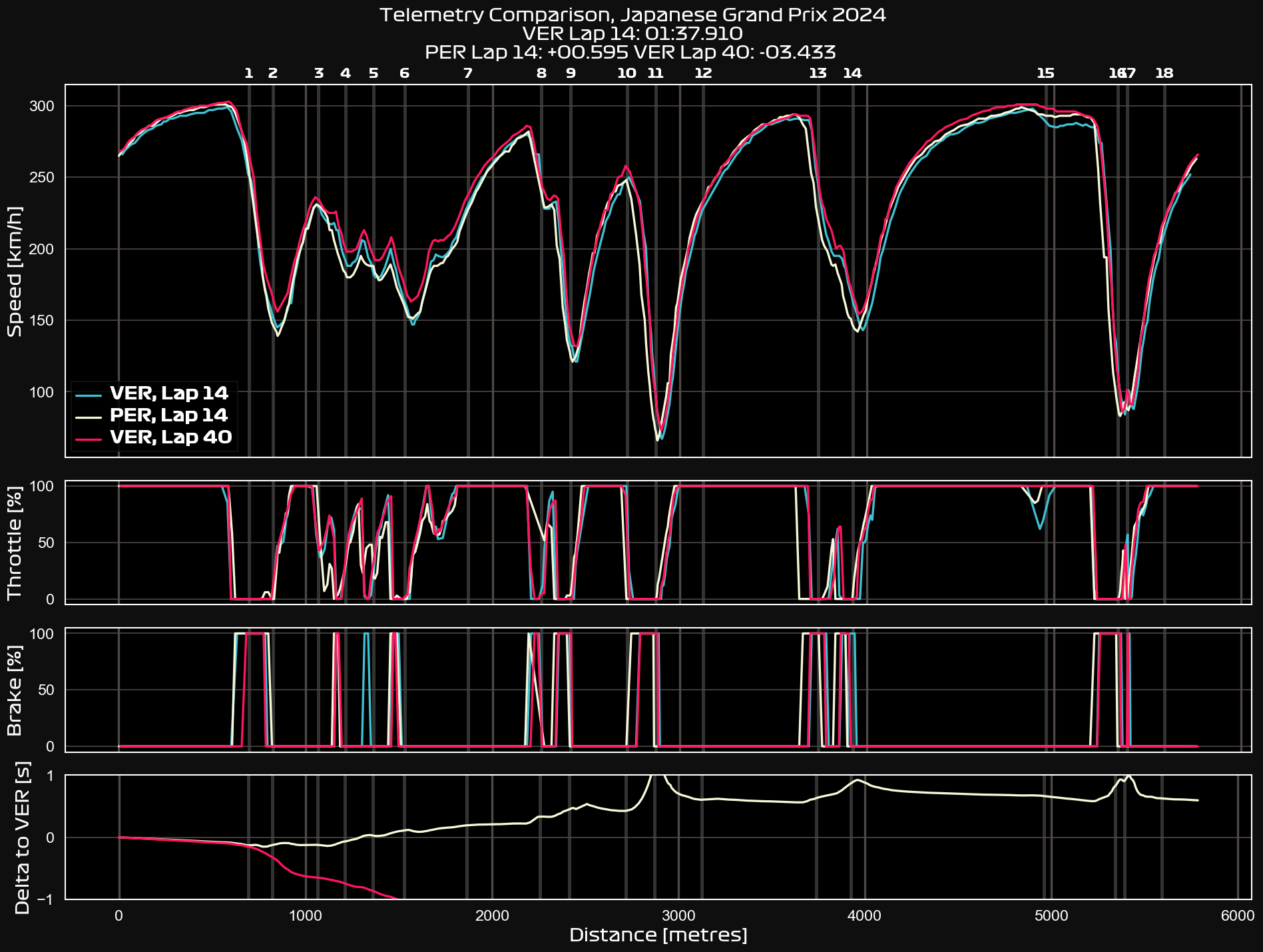
This also another interesting point; Max Verstappen was actually among the slowest in the straights. In the early laps (you can see the dots are blue, meaning stints 2 and 3), this is because he was lifting through 130R. His speed to the end improves because he stops. Perez, meanwhile, in the early laps has a higher speed trap speed because he isn’t lifting.
All this made me want to check where specifically Verstappen was fast, given that he won the race. The answer, of course, is in the corners. Checking telemetry between the two Red Bulls (link), Verstappen gains time through the esses in the first sector, and quite a lot through the hairpin of turn 11 and Spoon’s turn 14.
Further Down the Rabbit Hole
Here is where I get to the real meat of what I’ve been looking at. I realised that seeing who has the highest top speed is reasonably meaningless if you don’t also consider its converse, that being the speed a car is able to take through the corners. And, hell, I thought, I may as well check the data from every race this season!
The Technical Bit
If you don’t actually care how I’ve achieved my data, you can probably skip this bit. For those who want to assess my methods, please read on.
Low-Speed Corners
This is a slightly more complicated thing to work out. While I have easy-to-reach data for a speed trap plot, there’s a bit of wizardry involved in working out a car’s speed through low-speed corners. I’ve taken the intuitive approach with the assumption that the car with the highest minimum speed through a corner is the fastest through it — a car that doesn’t go below 50km/h through a corner is going to be faster through it than a car that goes down to 40km/h.
Given there’s no actual definition of what a “low-speed corner” is, I worked out a loose definition myself. My definition is that your minimum speed is below 150km/h (93mph), and that you must have slowed by at least 100km/h (62mph) while braking. As said, this is my personal definition, meaning it may not be the best one you can choose. I am no aerodynamicist; I simply watch F1 for fun and sometimes play racing games. That being said, I think these are pretty reasonable parameters, and I set about finding corners in the four races of this year that fit those qualities.[1]
For every lap for every driver and team, I found the average minimum speed going through each of these corners, and then averaged that for the entire race. This number, however, is reasonably meaningless. Red Bull’s average minimum speed over the five low-speed corners of Japan was 118km/h, but over none of those individual corners was his minimum speed actually 118km/h. Additionally, some circuits will have lower low-speed corners than others will (e.g., Red Bull’s average minimum speed over the three low-speed corners in Australia was 82km/h). Therefore, the team with the highest average minimum speed has been indexed to 1 for each race, and then scores for the other teams are displayed as a proportion of that, so a score of 0.97 means that team is 3% slower than the fastest average speed.
When considering a whole team, as opposed to a single driver, I weighted each driver’s score by how many laps they did (e.g., Max in Australia is weighted proportionally to the fact that he only did 3 laps, while Perez finished). This can still be a little problematic, as intra-team differences exist and one driver’s setup will be different from another’s. In Japan, every RB data point is covered by Yuki and every Williams data point is covered by Sargeant, so the results are heavily influenced by that specific driver’s skill, rather than a more generic team result.
Speed Traps
I did the same for speed traps, where the fastest car through the speed trap is indexed to “1” and other cars are arrayed as a proportion for it. I mentioned earlier that Japan’s speed trap is not on a DRS straight, so the only external factor that may be affecting a car’s speed is a potential slipstream, which is, most likely, going to be minor.
Other circuits, however, have their speed traps on DRS straights. This is a bit more problematic as the speed achieved on different laps is not achieved under equal conditions — DRS can give 10s of kilometres per hour extra speed. Thus, I have only considered laps where DRS was not achieved in order to get my data.
The Results, Finally
*Data from China is included, but this was written beforehand.
For those who skipped my technical explanations, welcome back! All you really have to know is that the fastest cars are closer to 1, and the slower cars are further down. A car at 0.9 can be read as being 10% slower than a car at 1.
I’ve combined both the low-speed corner stats and the speed trap stats into the same graph and then split the top 5 teams from the bottom 5. The solid lines represent how good in the speed trap a team is, while the dashed lines represent their ability around low-speed corners. Combining the sets of data is quite a logical choice, as speed on the straights and in the corners represent a trade-off that the team must choose, and so the lines should work against each other.
One thing to note is that there will always be a team at Index = 1, representing the best team for that race in that specific area (low-speed or top speed), but they may not always be on that graph because it was a bottom 5 team who was best at top speed, for example.
Finally, let’s have a look at them!
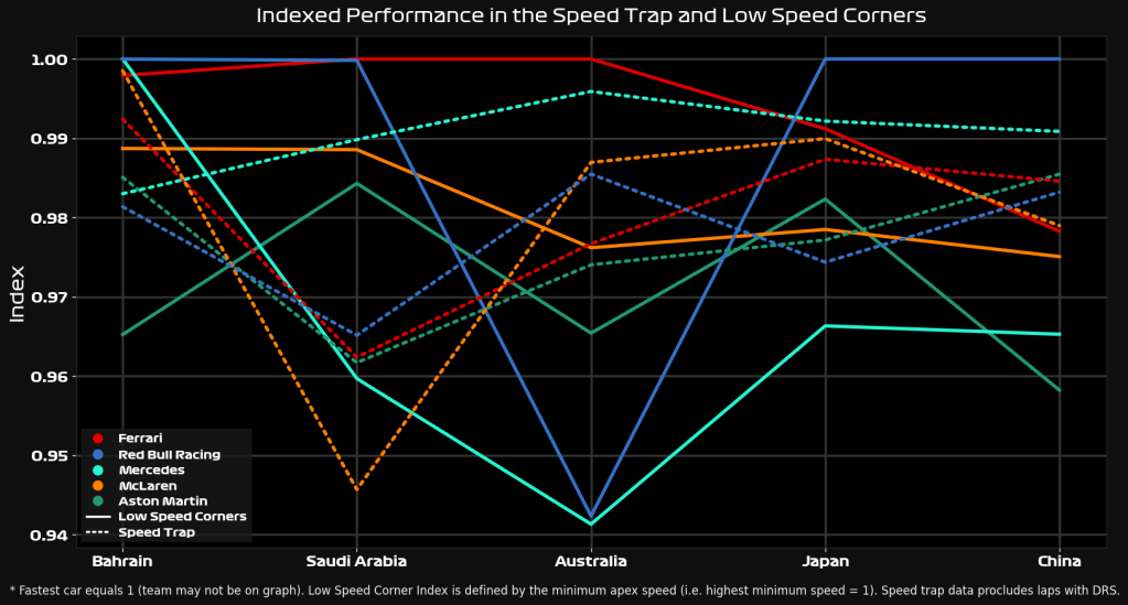
For the top teams, my immediate observation is that Ferrari is consistently good in the low-speed corners, either being the fastest car through them or within 1% of the quickest times. Compare this to their speed through the speed trap, which is decidedly middling as the top teams go. Their excellent tyre wear, demonstrated in Japan,[2] means they can afford to go into corners more quickly without worrying about shredding their rubber.
Red Bull shares the same philosophy, it seems. Australia is potentially an aberration, where Perez gives 95% of the data points, but I should expect the top two teams to continue this trend of speed through the corners and a relative trundle on the straights.
McLaren and Aston Martin seem to have gone for a more jack-of-all-trades approach, while Mercedes appears to have gone for high top speed and low downforce. I’ll talk a little more about this when we have a look at the bottom 5 teams in the chart below.
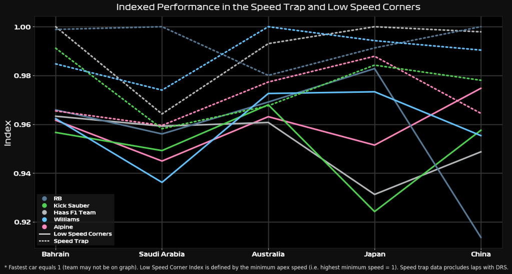
There’s a pretty consistent trend across the backmarkers this season — they all favour top speed over corner speed. This may be because of a general lack of ability to achieve downforce for them — if your aero surfaces are inefficient and draggy, it would be a disadvantage to run them. Less downforce, therefore, means a higher top speed.
My other hypothesis for this is that it’s a classic case of the prisoners’ dilemma. For those unfamiliar, a prisoners’ dilemma is a hypothetical scenario with two prisoners. The police have some evidence, but only enough to get a light conviction for both. If one prisoner betrays the other, the betrayer walks free while the other gets a very harsh punishment. However, if both betray each other, both get a medium-length sentence. The optimal decision for the group is to stay silent, resulting in a light sentence for both. However, the optimal decision for the individual is to betray the other — in the case where your partner hasn’t ratted you out, you get to walk free instead of a light sentence, while in the case where you have been betrayed, you reduce your heavy sentence to a medium one. This mistrust and poor incentives lead to the worst outcome for the group as a whole.
How does this relate to Formula One, you may ask? Let’s change “betray” and “keep silent” to “top speed setups” and “high downforce setups”. A high downforce setup is likely to give faster lap times, but you’ll be slower on the straights. Let’s say you choose this, and a rival team chooses a high top speed setup. You can outpace them in the corners, but thanks to DRS, they can catch up on the straights. Worse, their lower drag levels make it pretty likely they’ll overtake you. You’ll be able to stick to the back of them, but their higher top speed means you can never re-overtake. The best choice to prevent this is to match their setup. Ensure you have less drag and a higher top speed.
The prisoners’ dilemma leads to this scenario, where both teams are forced into a higher top speed setup. For the individual team, in both scenarios of a rival team choosing downforce or top speed, choosing top speed is better. Against a downforce setup, you can overtake more easily and stay ahead. Against a top speed setup, you have to match to prevent the same from happening to you. These incentives are true for your rivals too, resulting in a matched top speed strategy. The ultimate result is that overtaking is just as difficult as on a high downforce setup, except you’re both slower.
In a section of the field where the spread is high and DRS trains are few, you can’t rely on top speed to pull you forward, so your setup must have the best possible pace. Where field spread is low and DRS trains are long, straight-line speed is the only choice.
When you apply this reasoning, it explains why the bottom teams, who are often involved in the fiercest battles, adopt a top speed setup. The Red Bulls and Ferraris, meanwhile, are at the front of the field and can pull away from the pack, taking advantage of their downforce setups. This explains why Lance Stroll struggled so much in Japan — he was able to stick to the back of Hulkenberg, but he simply did not have the top speed to overtake him.
Conclusions
To me, this is a very compelling chain of logic. It seems to explain quite a lot of what I’ve seen in the data, and I can apply it to Stroll’s real-world example.
However, I must concede that I’m not an F1 strategist, and I could be interpreting something from the data that’s purely coincidental. I’ll also point out that setups are more complicated than “top speed or downforce”, this is just a rough simplification. I’ll let you, dear reader, decide whether I’m proselytising the truth or not.
Hopefully, China will give me something a bit more concrete to look into, or else I’ll be stuck digging rabbit holes for another fortnight. After Sprint Qualifying, I’m feeling pretty hopeful!
Appendix
| Track | Low-Speed Corners (per my definition) |
|---|---|
| Bahrain | Turns 1, 4, 8, 10, and 14 |
| Saudi Arabia | Turns 1, 4, 13, and 27 |
| Australia | Turns 3, 11, and 13 |
| Japan | Turns 2, 9, 11, 14, and 16/17 |
| China | Turns 2, 6, 9, 11, and 14 |

Leave a comment